Bubble Chart Explanation
What is a “Location Quotient?”
This calculation, which is also called a “LQ”, is the relative concentration or density of a specific cluster in the region versus the US average for that cluster. Specifically, the LQ is calculated by taking the per capita concentration of that cluster’s employment in the region, divided by the same per capita concentration for the US. A 1.5 LQ indicates that the region has 50% more cluster employment on a per capita basis than the US, which is a sign of relative local strength in that cluster. When talking about occupational employment, we use the term “CQ”, or concentration quotient.
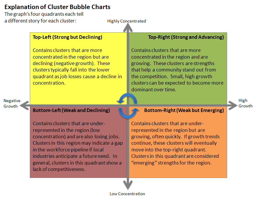
How to Read a Bubble Chart
“Bubble charts” are a highly useful tool for analyzing cluster strength in a region. A bubble chart provides three metrics for each cluster: growth rate (%), location quotient(which is the per capita concentration in the region relative to the US), and number of employees (the relative size of the bubble).
The location quotient (or LQ) for each cluster is presented on the vertical axis, which shows the relative concentration of employment in this cluster versus the US concentration. LQ is a relative measure, such that a high concentration in one cluster means that other clusters will have lower LQs. Having a LQ below 1 indicates a lower concentration relative to the denser clusters.
The graphic below illustrates how the bubble charts operate and the implications of cluster locations in each quadrant.
(c) Avalanche Consulting, Inc.